Can I just say…I love my book covers. And since I have almost nothing to do with that creative process, I can brag and compliment the Revell design team with my WHOLE HEART!!!
I’ve loved each cover for different reasons, and every cover endured a unique process to arrive at the final masterpiece.
The First Three Covers
Love Amid the Ashes went all the way to the first marketing meeting (released to salesmen) with the first cover, but its less-than-approving reception sent my AMAZING design team back to the drawing board. That’s when the bi-panel idea arose, and they produced the final cover we all LOVE!
And what woman (or teenage girl) doesn’t feel light-headed when she sees that hottie, King Solomon, on the cover of Love’s Sacred Song? (Revell still won’t give me his phone number—I just want to thank him for being the reason so many folks buy that book! J)
Love in a Broken Vessel was an interesting assignment for the designers because both Hosea and Gomer were older in this story—late twenties, early thirties. The Revell designers chose mature models, who portrayed their harsh life experiences with a single glance. Loved that cover!
First Email About In the Shadow of Jezebel Cover
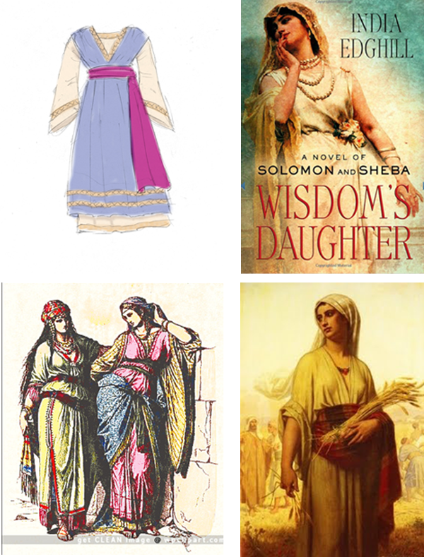
On March 15, 2013, I received my first email from Cheryl Van Andel, Revell’s Senior Art Director, about cover design. I always get excited about emails from this dear lady! She forwarded an email from Dan Thornburg, who had designed my previous three covers, and included a drawing from him with several pictures he proposed. Here’s his email and the pix:
Here’s a sketch of the idea for her costume. We could substitute cords of some kind for the magenta robe and use a shawl in that color.
I’ve included a few pics to show the feel I’m hoping to get. The wrap or shawl would have some kind of pattern or weave also.
 My Response
Since this is our fourth cover design together, Cheryl and I know each other well enough to give honest feedback without dancing on egg shells. She knows I LOVE Revell’s work, and I respect her skills as a designer. So here was my response:
- I’d love to see the Temple (column, limestone blocks, etc) as the backdrop
- I love the image of India Edgehill’s woman, even her stance, but Jehosheba would be fearful, looking over her shoulder to see if someone was watching/following her—a SHADOW on the wall!
- LOVE the cords idea instead of the sash.
- The patterned shawl sounds awesome.
- I think the sketch of the robe is very nice. Not too flashy (because she’s gone from princess to simple wife of high priest).
- And I know we like jewelry (Ha!), but this one should be really understated again… I liked the beads on the pic you send of the woman gathering wheat—and her head covering was plain as well.
Hooray! Cover Is Done—Not.
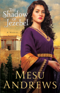
So, on May 14, 2013, I receive the exciting email from Cheryl with the pdf attachment of the final cover! Here it is…see anything different than the book released in March 2014?
The initial title for the book had been approved as The Shadow of Jezebel, and when we saw it on the cover—along with that beautiful young girl—it seemed that we were insinuating the beautiful girl WAS Jezebel.
Poor Cheryl. I replied to her with a sheepish “uh-oh” email, saying I’d like to add the word “In” to the title. She was extremely gracious, but that little word caused havoc on that cover! Let’s just say—34 emails later, with the input of Cheryl, my agent, my editor, my marketing manager, and Revell’s marketing director—Cheryl found a way to get that little word “In” added to the title. J She’s a miracle-worker, and I love her dearly.
Worth the Effort
 You may not stop to think about the models that pose for the cover pictures. I certainly didn’t—until a few days ago, when the father of our Sheba model contacted me through my website.
He wrote a very simple “Thank You” for allowing his daughter to appear on the cover of In the Shadow of Jezebel. And I wrote a very grateful reply, expressing my appreciation for his daughter’s beauty and perfect expression of my character’s spunk.
The girl’s real name is Chelsey.
I don’t know if she’ll ever read this book, but I’m so thankful we changed the title—if for no other reason than Chelsey. I wouldn’t want her to be labeled Jezebel for the rest of her life. When I answered her dad’s email, I could confidently suggest that she read about Sheba, the character she portrayed on the cover.
I pray that Chelsey is proud of the woman she represents and that her life reflects the love and healing Sheba finds in Yahweh.


Comments 5
WOW! What an amazing ‘behind the scenes’ process many of us don’t even consider. Thanks for sharing this part of your exciting journey with us. XO
Isn’t it amazing to think about all that goes on behind the scenes? I’m sure I don’t even know the 1/2 of it!
I always LOVE hearing more about the creative process that goes into creating book covers. I’m slightly obsessed with cover art =) I think the cover for In the Shadow of Jezebel turned out amazingly! I kind of love the original cover for Love Amid the Ashes too, it’s just really stunning. The bi-panels will always be favorites of mine though. Thanks for sharing with us!
How fun that you love the original cover for LATA!! I’ll have to tell Michele we have at least one fan for that one!! ha! She was devastated at the retailers’ (bad) reaction to it, but I’m glad you liked it. It’s such a subjective thing. You really never know… I, too, love the bi-panels. I’m not sure I’ll ever have covers I like better than those. They’re just stunning. At the same time, I was thrilled to be contacted by the model’s dad on ITSOJ. That little fact will always make that cover special too. I suppose like each book, each cover will have a special place in my heart. 😉
Cover art is a fun study, isn’t it? Glad you enjoyed the article, gal! Blessings on ya!
What a beautiful cover! And how great of you Mesu to share these delightful facts with us! A lot of fun and extremely interesting! Good for us to appreciate the behind-the-scenes of all your hard work.