
 I love a good hotdog, fresh off the grill or while watching a baseball game at a stadium with family. What I wouldn’t love is watching the process of making hotdogs. I’ve heard some pretty icky things go into those “tube steaks,” so sometimes ignorance-is-bliss, right? Well, NOT with cover design!
Today, you and I get to dive into the process of cover design for my May 9, 2023 release, In Feast or Famine. You’ll see never-before-released photos used as the starting point for my brilliant cover designers.
You may have already seen the final cover for In Feast or Famine on some online retailers, but you’ve never seen the photos in this post!
My First Four Choices
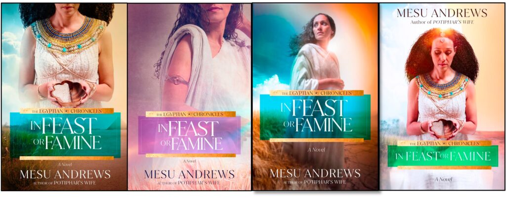
On May 6, 2022, I got an email from my senior editor with an attached pdf that included these four cover choices:
It’s often overwhelming to see the first glimpse of what someone else thinks your main character might look like. Though I give some direction to the designers in an extensive questionnaire, that first glimpse of a real face on the cover always startles me.
However, cover design is so much more than a face. It’s movement, color, texture, and emotion. It’s first glance and lasting impressions.
A great cover design tells part of the story before a reader picks up the book.
Which of the four proposed covers is your favorite? Both my editor and I chose the one on the far left, but here are some fun examples of how these brilliant graphic artists used outtakes to create the covers you see above…
From Outtakes to “Oh My Sakes!”
My cover design team has never sent samples from the photo shoot. So, witnessing the transformation from original snapshots in a conference room to the first design options was a whole lot more fun than manufacturing hotdogs!
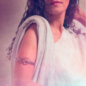
Cool Sample #1

Outtake of Model Holding…Well, Nothing!
Consider the design time and talent required to transform the photo above into the emotional story the photo below shows us. Amazing.
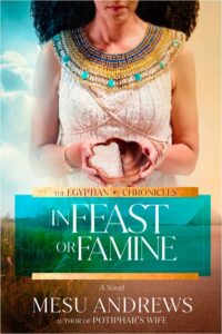
Model Holding Feast/Famine Bowl (With Feast/Famine Background)
Cool Sample #2
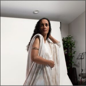
Look At All That White!
Isn’t it amazing what a graphic artist can do with a bunch of white material draped over a white robe against a white background with white lights and then…vwallah!
Alluring Color and Texture!
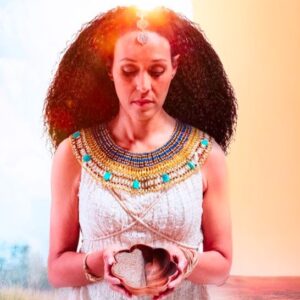
Cool Sample #3
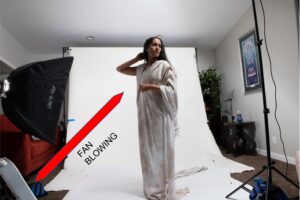
Going For the Windblown Look
In the photo below, they’ve inverted the image, added more hair to the windblown look, and–WHERE’S HER ARM? Somehow that glow of light hides the arm she had lifted to her head. Fascinating use of highlights and color!

One-Armed and Inverted
Officially–My Cover Design Superheroes!
I’ve always known my design team does a great job, but it’s even more stunning to see the whole process. (Maybe we should all take a tour of a hotdog factory after all? Okay, nah!)
No matter how awesome the process, we still had to make a choice on our FAVORITE cover design.
Who Gets To Decide?
Original IFOF Comp #4
When I got that original email in May, my editor hinted at which comp was her favorite. I was excited that we agreed! Though I’ve always had considerable input on my covers, according to most traditional publishing contracts (mine included), the author has very little legal right to insist on any cover specifics. For the most part, a book’s cover is decided by the pub board (sales, publicity, editorial, and design teams working together).
Thankfully, I’ve liked every one of my covers! Each one–in my opinion–has been beautiful and eye-catching in its own way.
This time was no exception. The cover above on the left is the original comp as it came in the email from my editor on May 6, 2022. I asked a few questions, suggested some changes, and the final cover is very similar to its original design.
What Do You Think Of The Subtle Changes?
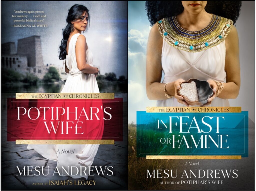
The Egyptian Chronicles Series
Here’s why we made the changes:
- We changed the theme color from the original sepia/brown tones to gray on the final cover so it would match Potiphar’s Wife, the first book in The Egyptian Chronicles Series.
- We smoothed the texture of Asenath’s robe to represent a more elegant “fine linen” like the daughter of a high priest would wear–and eventually, the wife of Egypt’s vizier.
- We added a little more color to the model’s lips and gave the title box more blue tones rather than green. (Honestly, I was afraid red & green title boxes lying side-by-side on someone’s table would look like Christmas colors! LOL! It’s crazy what we authors worry about on our cover designs!)
What Do YOU Think?
Feel free to leave your answers in the comments below or email me at mesu@mesuandrews. I love hearing from you!
- If a cover is supposed to give a glimpse of the story before you read the back cover…what would you think this story is about?
- What’s your favorite thing about this cover?
- If you could change one thing about this cover, what would it be?

Comments 8
I like the finished cover. Most of the pictures above make her look at least middle aged. If Joseph was only 30 when he stood before Pharaoh I figured his wife would be younger. This woman looks at least 40. But the final cover looks much better, the lines of her neck look softened and though you don’t see her whole face, what you see looks younger. I like the colours of everything, the turquoise color is very pretty.
I wonder what’s in the container she’s holding, why is it half full and half empty? If I were in the bookstore and saw this book for the first time, that would be my first question. I’m sure that will be answered in the book.
I think the best thing about the cover is the soft colours. They are relaxing. And of course the author’s name since I enjoy her books so much.
I wouldn’t change anything about the cover. Other than that the book isn’t in my hands right now lol!
Author
Hahahaha!!! Alondra, I love you! I would change that last detail too! I’d love to have this book in readers’ hands sooner than May 9th too. I can hardly wait for y’all to read the end of Joseph’s story!!!! It’s been soooooo fun to write the blessed portion of his struggles in Egypt. Though, of course, there was still conflict (which has to happen or there’d be no book), it was so much easier to write a book about a hero and heroine who were so much more LIKABLE than the last book. 🥰
I agree! The finished cover is the BEST! It tells a story without speaking a word! Makes you curious on how the author is going to tell us what it means, how it will play out. You did that very well! Great read!
Author
Yay! Glad you like the cover, Mama! ❤️
I love the cover but I will admit I also liked the 3rd cover in the line up. Then when I took the second look at the cover y’all picked, it’s much more intriguing. I’m thinking like Alondra what is she holding and what meaning will it take on in the story. I would say where one side is full and the other is empty that it matches the title so well. It amazes me that the cover designer gets it right most of the time with a little nudge from the authors. I love that it matches Potiphar’s Wife because they are so pretty together. I could never add or take away anything from it. I’m not an artist/crafty person.
Author
I love that both you and Alondra picked up on the bowl! That was my hope–to say “feast or famine” with that one little prop. Hooray!
A question: my dream as aspiring catholic writer of religious historical fiction is a religious novel set in a fictional world and based on a modern version of a biblical character, the world of this my future novel is based on the world of today. Good or bad idea?
Pingback: Who Is Asenath? - Mesu Andrews